Design of the Month · September 2011
-
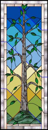
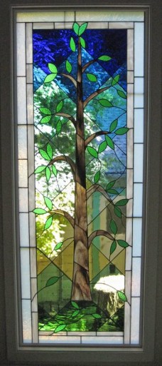
"Tree of Life"
The entryway to our hillside home was simply too dark. The dinky gold-colored pane in the front door and the large obscured-glass window nearby were not admitting enough light. We wanted to replace both with my panels. Because of their proximity, we decided to coordinate them, and I played around for several years with possible designs without being thrilled about any of them.
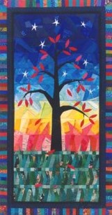
I was new to glass in 2003, I had searched for Tree of Life images and found one I loved by a quilter, which I saved. Scrolling through my photos one day, I was struck by the potential of this design for my two-panel entry. I wrote to the quilt designer for permission to base these panels on her design, which she granted. (I reference her on my website.)
One of the challenges I faced was that the door panel was quite a bit smaller than the window panel. The window measured 28" x 75", but I didn't want the door panel to be more than half the door. The other challenge was how to adapt something that worked in fabric to something that worked in glass and would complement our home. The quilt used several horizontal panels of color behind the tree to represent earth and sky. I was concerned about creating hinges across my panel, so my early versions had stepped horizontals, so that no line went all the way across. Input from Glass Eye 2000 forum participants convinced me I needed to try harder, and I opted for diamonds to represent the layers.
To make testing all these background ideas feasible, I drew the tree and grouped it so that I could create several variations on the background and then just paste in my tree, delete the unneeded background lines, and connect the tree. I also used the software's cut and paste capabilities to copy the top part of the tree from the large window into the door panel space and adapt it to the different size. At the time, I was enamored of arches in glass, so I tried to make the top part of each window an arch. I decided the format worked for the small window, but not the large one. Grouping and cut and paste made all this easy to try out.
Although I loved the intense colors of the quilt, I wanted more light into the entry, so I experimented with different color options, using paler shades while still giving the variations similar to the original. The color selector and glass samples in Glass Eye 2000 made it easy to try a lot of choices. When I thought it was right, I printed a full-sized pattern to provide a sense of my results before I purchased any glass.
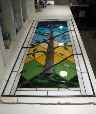
During this process, I started to worry that the door was too colorful. I am conscious of having FILLED my home with my stained glass, all of which I love, but a potential buyer in the future might find it less interesting, so everything else is removable. Since an entry door is less easily replaced, I wanted to make it more generally appealing. Using the program's ability to do global color changes, I transformed all the colors into different intensities of patterned clear glass and located a bevel that was perfect for the leaves.
I also used photos of the original spaces as a background that I overlaid with my designs, allowing me to email the results and get input from my daughter (a freelance medical illustrator who lives 2000 miles away) on design and color.
I used the Line Properties command in Glass Eye 2000 to make lines red to show where I wanted to put strongline. On the large panel, I also added blue lines for the rebar I planned for the back. I printed this out and took it to my local stained glass shop for input. One of the employees there has extensive experience with large scale lead came windows. I was going to use came instead of foil because of the streamlined design and use of one panel in an exterior door. Lex suggested using the rebar on the diagonals to minimize its visibility and convinced me to do both windows in foil to reduce their weight. Since county regulations require tempered glass in doors, I needed to have my design faced by a tempered panel, which meant that weatherproofing was not an issue.
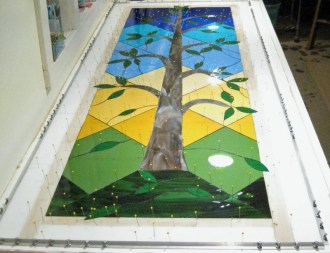
The fabrication process went smoothly, although my small studio is definitely challenged by a large panel. My bench is only 32 inches wide (but 14 feet long) and my total workspace from the wall to the storage shelves in only about 6 feet, so turning the panel over or reversing it to work easily on the other side was a major adrenalin rush!
My husband and I had the obscured window glass replaced with clear and set my new window panel in front of it with trim molding to hold it in place. We ordered a mahogany door with the proper opening for the door panel and stained and varnished it before installing the tempered glass and my panel. The end results are great! The entry gets a lot more natural light — so much that for several months after the new door went in, we would glance downstairs and think we had left our old door open!
~ Lynn Eichinger
About the artist
Lynn Eichinger spent most of her life believing she had no artistic ability at all, despite having a daughter who is a successful medical illustrator. After becoming prematurely unemployed, she took a stained glass class in 2003 to create a single panel for her home. She discovered that her problem with art had been not working with the right media. Her next big discovery was Glass Eye 2000, which allowed her to create her own designs instead of buying them. A key feature of Glass Eye 2000 is the ability to trace photos, which allows her to create natural-looking objects. She has done a number of commissions and would like to do more, now that her house has reached its stained glass capacity. You can see more of Lynn's work at Sunrise Art Glass, or you can contact her by email.
This pattern may be used to make one or more artworks for sale or personal enjoyment. This pattern may be printed for personal use only and may not be sold or given away in printed or electronic form.
Each month we feature a project designed using Glass Eye 2000. Do you have a project to share with the world? Contact Dragonfly Software and your creation might be our next Design of the Month.