Design of the Month · November 2011
-
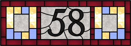
"58 Orford Street"
We had new neighbours move in next door in the summer of 2007, Mr. and Mrs. Murton and young Master Murton. Over the years, the house had changed hands many times. It is a Victorian semi-detached property built in 1880, yet it had a cheap imitation Georgian door that was a feature when we moved here in 1987. The new owners decided to have a new bespoke door made by a local craftsman to mirror the original design that existed in a number of local properties. The door was hung in the late summer and our new neighbours advised us that a glazier would be fitting glass while they went on holiday to the Far East and would we mind letting them in. I chanced a comment "Not interested in stained glass panels then?" The response was "Do you know anyone? Where did you get yours from?" "Made them myself" I retorted. "Oh we'd better talk on our return." And so Project 58 began.
This was never going to be a clear-cut assignment. Both parties had met while working in the jewellery trade but had changed careers: one to marketing, the other to architectural modelling. So, armed with copious sheets of paper and the very best of my coaching and soft-systems skills I went about eliciting design requirements. "He" wanted the door panels to reflect a design seen locally that resembled crazy paving; "She" did not want anything that looked like it had the hallmark of Spiderman. Tough order. One thing they agreed on was for "floating sapphire" shapes to be incorporated in the door panels, but a degree of latitude existed for the fanlight. The first part of the commission was to design the two door panels. Based upon the diametrically different requirements, I drew up two designs in Glass Eye 2000. The child of the house had the deciding vote, and he happened to pick the design that I favoured. Well done!
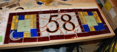
Now for the fanlight. This was a different kettle of fish as Mr. Murton had free rein to ask for whatever he wanted. He had a very strong desire for a heavy lead design. I had built this into the two door panels and suggested that the fanlight ought to be much lighter but that I could incorporate his wishes for the crazy paving look. This was an acceptable compromise but he insisted that the "58" had to be grossly oversized and resemble something from a Kellogg's packet. Also, the border had to be red like the door panels but laid out asymmetrically.
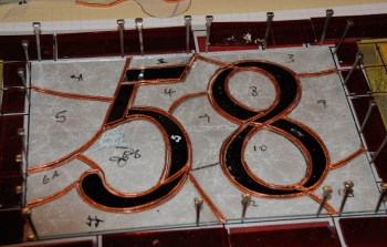
I drew up a compromise drawing in Glass Eye 2000 offering alternative side panels and I set about laying the pattern on the making-up table. Whenever I use Glass Eye 2000 with a client I only ever colour the glass based on rough ideas of colour that they want. I keep glass libraries well away from them until the pattern is agreed. On seeing the pattern, Mr. Murton did not like the "5". At the time, I reacted to his suggestion by using correction fluid and a permanent marker to edit the drawing. This was the easiest way of getting consensus, but then so easy to change back in Glass Eye 2000. This is where the real strength of the software helped me portray what the final product would look like, but also, and crucially for me, to be able to estimate material usage and provide a rough range of costs. Once "Pandora's Box" was opened (i.e. my actual glass samples) we were at least restricted to colours and it was a relatively easy case of using the glass library in the software to modify the usage in the design. This stage of consultation is always left to the end of the exploration phase as I tend to think people get caught up with the myriad of choices and lose sight of the design issues. One step at a time, please. A good overview is necessary but detail comes later.
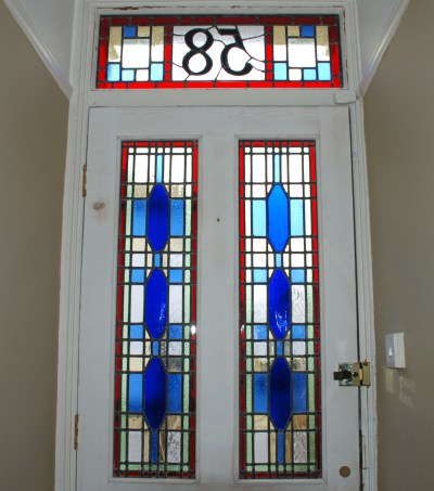
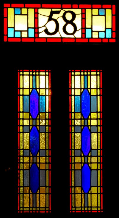
The other aspect of the design parameters I was given was for a jewel effect in the fanlight. I was not happy with this and I drew up the design accordingly. Again the value of Glass Eye 2000 came to the fore as there was no problem visualising my concerns, it just jumped out so again we were able to agree on an acceptable change. So we ended up with a big "58" in the style that existed in the client's head, a crazy paving design executed around it using copper foil and a somewhat avant garde design with side panels that followed no particular Victorian code yet somehow fitted in. All in all, a very happy customer and a satisfied artist.
~ Tom Owens
About the artist
Tom Owens accidently bumped into stained glass design in 1996 while trying to match cobalt blue panels in a salvage piece he had bought for his Victorian home. He was absorbed by the bug and quickly designed and made panels that were really far too complex for a beginner — but this only fuelled his determination to develop his skills. In his early pieces he used to draw cartoons manually on lining paper, but he chanced upon Glass Eye 2000 and has never looked back. Initial sketches and ideas are doodled on paper but these are transferred to Glass Eye 2000 at an early stage where they can be manipulated and toyed with until a design with integrity emerges. He has undertaken small commissions for friends and recently restored an Edwardian door for a public house in Ipswich. Examples of his work are at his website, or you may contact him by email.
This pattern may be used to make one or more artworks for sale or personal enjoyment. This pattern may be printed for personal use only and may not be sold or given away in printed or electronic form.
Each month we feature a project designed using Glass Eye 2000. Do you have a project to share with the world? Contact Dragonfly Software and your creation might be our next Design of the Month.